Throughout the creation of both our music video and our digi-pak (consisting of our album artwork and magazine advert) we have included iconic features to create links within our products so that it is easily identifiable from the audience’s perspective that these products fit together and work to market the same overall product: that being our music video.
Below is a video giving detail on the creative decisions which we made to directly link these products and allow there visually to be identifiable factors signifying the connection between the products. Within the video we also give an overview of some of the recurring themes which are present throughout our music video and two ancillary texts, an example being, the protagonist is heavily featured consistently throughout to create an enhance the idea of ‘star image’ for the main performer.
The main points mentioned within the video above illustrate the main links showing the effectiveness of the combination of all our media texts: those being the music video, album artwork and magazine advert.
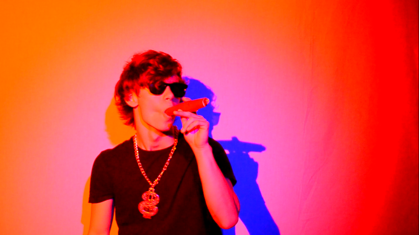
One important point mentions refers to the recurring colour theme through out the piece of red and blue, this colour scheme was introduced for multiple reasons, however it helps show a clear link between the three products. We chose these colours as they were colours which we felt could be symbolic in showing the protagonists good and bad side, whilst giving clear visual links (within our music video) between shots taken in the drama studio (with the use of red and blue lights) as well as with the shots taken in outside locations wherein the colour scheme came through the costume of both the Protagonist and the Harlot.

Additionally the link through the colour schemes of the products was created due to the location for the filming of the lip-syncing and the capturing of the shots for the digi-pak being the same place: the drama studio. In which we had access to a lighting rig with changeable coloured gels, of which we were able to choose the colours we wanted to use and therefore created clear iconic link by controlling the choice of colour and additionally the intensity of the lighting to help balance the colours we wanted for particular shots. (As visually shown within the image below)

Significantly the protagonist is the main focus (as prior mentioned) within the majority of shots within our music video as well as within our digi-pak, again creating a link through the obvious star image being portrayed by the constant featuring of the protagonists image. For an audience member they can also recognise that the ‘performer’ from the music video is heavily featured in the album artwork and the advert therefore allowing them to clearly recognise that these two ancillary texts are promoting the main product, as illustrated in the image below.

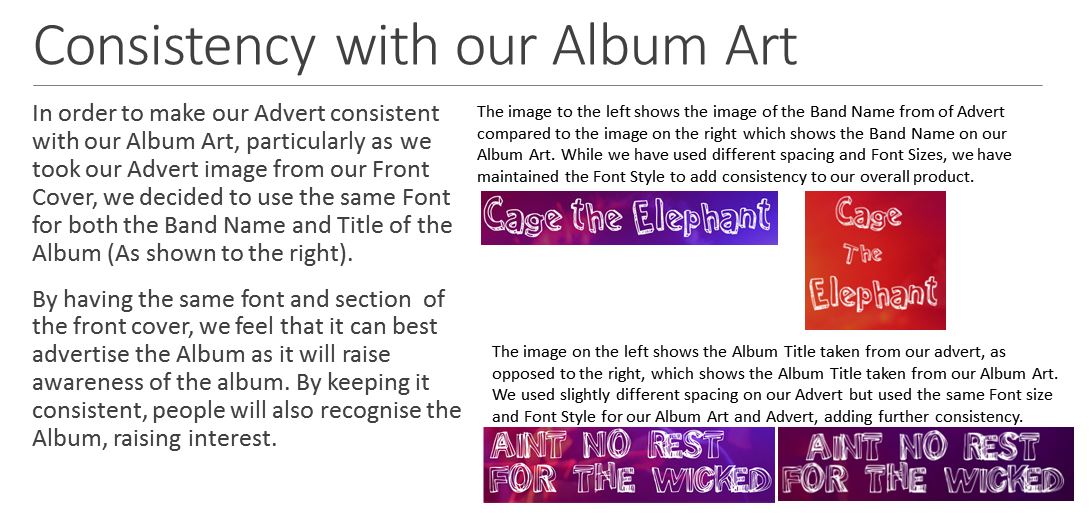
Another clear link between the two ancillary texts and to an extent the music video is the use of the same text and additionally font within the album art and the magazine advert. As the repetition of text creates visual links which the audience can pick up on and therefore see the link between the three products. The text featured mentions the band name ‘Cage The Elephant’ and the song name ‘Ain’t No Rest For The Wicked’, which is heavily included in the lyrics of the song which can be obviously heard within the music video as well as visually represented through the sped up footage which is repeated periodically within the video.
Therefore this ensures the audience can see a link showing the effectiveness of our products together as they continually enforce similar iconic styles and themes through the use of colour, costume and text featuring key words such as the name of the song which can show clear links to our audience.
Overall I believe that the continuity between the three texts creates interest for the audience as they can see clear links from the promotional packaging and therefore are more excited and captured as an audience towards our product. Also the clear links allow the audience to become familiar with the name of our song and some of our chosen themes such as the use of colour to represent the protagonists deterioration.
The fact that our audience should be able to identify this quickly means they will become interested in the narrative faster and thus will be more engaged within the music video and subsequently the ancillary texts which promote it, which as a result shows the clear effectiveness of the three products collectively as the links between each other support and promote the products equally.
